Case study 04 · storefront design

Buddha Therapy
A wellness brand selling a premium guided journal. The design brief was the opposite of BCC: no noise, no gimmicks, just a storefront calm enough that a $50 journal feels obvious.
A wellness brand selling a premium guided journal. The design brief was the opposite of BCC: no noise, no gimmicks, just a storefront calm enough that a $50 journal feels obvious.
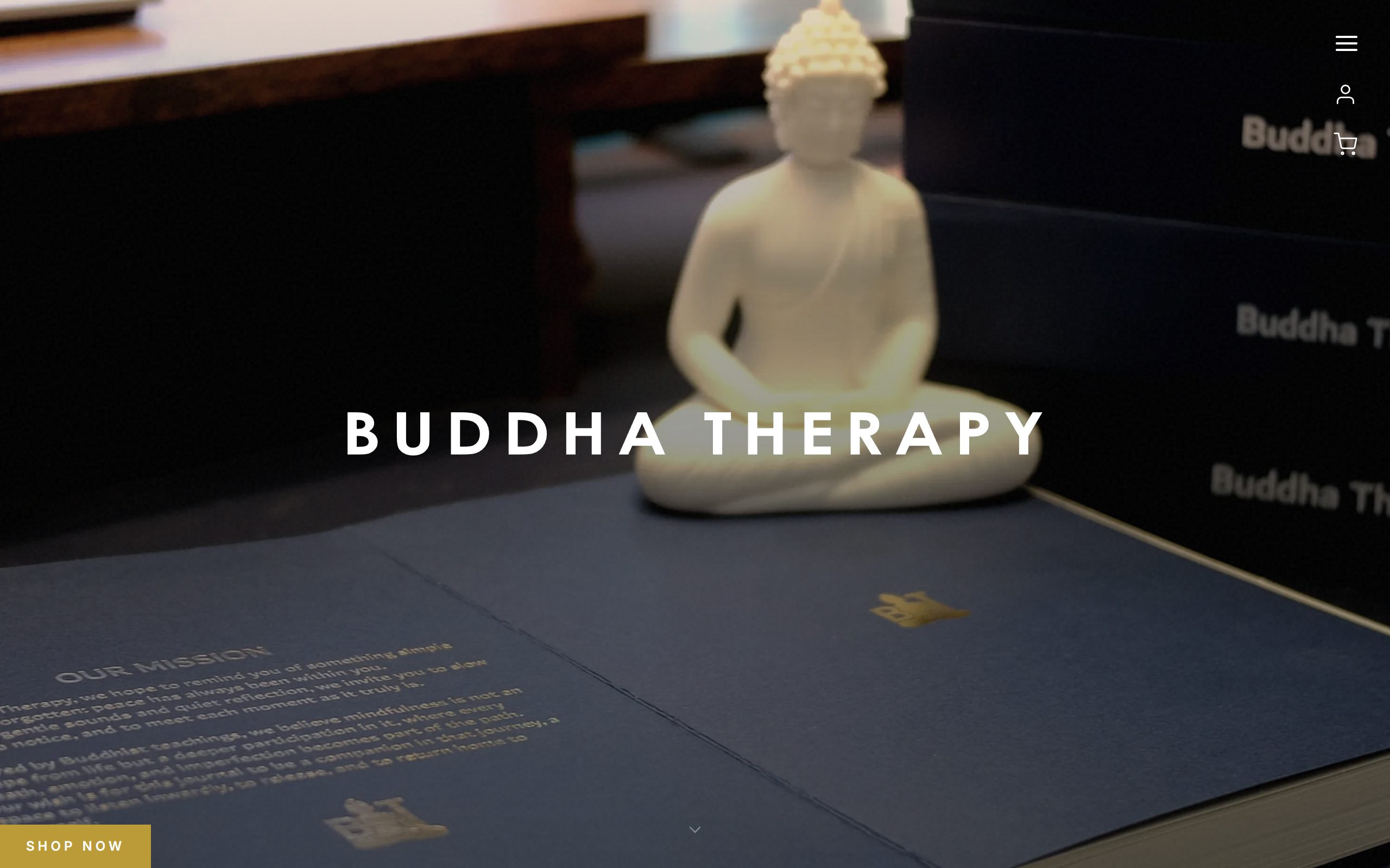

The storefront hands everything off to Warehive: automated welcome and cart-recovery email runs on its own, every visit and order is tracked into the same funnel view, and content or pricing changes go live without touching code. The front end stays a pure brand surface; the machinery lives underneath.
Premium pricing is a design problem before it's a marketing problem. The same product on a template store and on this store are two different products in the customer's head. That perception gap is the margin.